
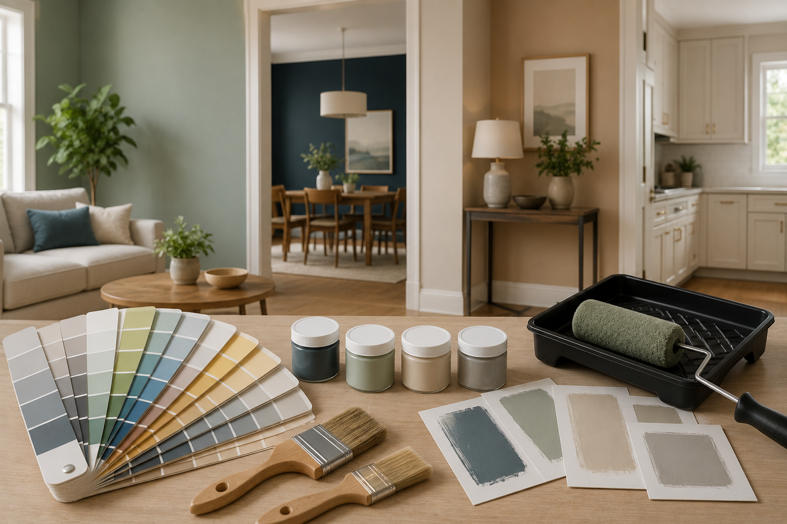
Choosing a paint color feels like it should be simple, pick a shade you like and go, but the color that looked perfect on a tiny paint chip often looks entirely different once it covers an entire wall in your actual room’s lighting. Understanding how to choose paint color properly means accounting for lighting, undertones, room size, and how a color will actually live with your existing furniture and finishes, not just how it appears in isolation.
This guide walks through a practical, step-by-step approach to choosing paint color with genuine confidence, covering lighting effects, undertones, testing methods, and room-specific considerations that most people overlook until after the paint’s already on the wall.
How to Choose the Right Paint Color for Any Room
Before choosing a specific color, test actual paint samples directly on your walls (not just paint chips) in multiple areas of the room, and observe them across different times of day, since natural and artificial lighting genuinely change how a color reads. Pay attention to a color’s undertone, the subtle underlying hue beneath the main color, since undertones can clash with existing furniture, flooring, or trim in ways that aren’t obvious from a small paint chip alone. For smaller or darker rooms, lighter, cooler tones generally help a space feel larger and brighter, while larger, well-lit rooms have more flexibility to handle deeper, richer colors without feeling closed in.
Steps To Choose the Right Paint Color for Any Room
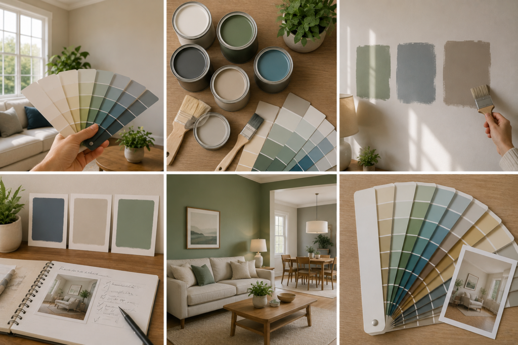
Step 1: Understand How Lighting Changes Paint Color
- Natural Light Direction Matters
The direction your windows face significantly affects how paint colors read throughout the day. North-facing rooms tend to receive cooler, flatter light, which can make colors appear slightly duller or cooler than expected. South-facing rooms receive warm, consistent light throughout the day, generally making colors appear brighter and truer to their intended shade. East-facing rooms get warm morning light that shifts cooler by afternoon, while west-facing rooms experience the reverse, cooler in the morning and warmer, more golden in the late afternoon and evening.
- Artificial Lighting Effects
Different light bulb types also affect paint color perception. Warm white or soft white bulbs (lower Kelvin temperature) tend to enhance warmer paint tones and can make cool colors look slightly muddy. Cool white or daylight bulbs (higher Kelvin temperature) do the reverse, enhancing cool tones while potentially making warm colors appear slightly washed out.
- Why This Means You Can’t Trust a Small Sample Alone
A color that looks perfect on a paint chip under store lighting can look genuinely different once painted across an entire wall in your home’s specific combination of natural and artificial light, which is precisely why testing directly in your space matters more than trusting the chip or an online color preview.
Step 2: Understand Paint Color Undertones
- What an Undertone Actually Is
Nearly every paint color, even ones that appear simple and neutral like white, gray, or beige, contains a subtle underlying hue called an undertone. A “gray” paint might actually carry a blue, green, or purple undertone beneath its surface appearance, something that often only becomes obvious once it’s painted next to other colors in your room.
- Why Undertones Matter So Much
Undertones are frequently the reason a paint color that looked great on its own suddenly seems to clash once it’s on the wall alongside existing flooring, trim, or furniture. A gray with a subtle purple undertone might look muddy or slightly off next to warm wood flooring, while the same general gray shade with a blue undertone might read as clean and neutral in that same space.
- How to Identify a Color’s Undertone
Compare your chosen paint chip against a pure white sheet of paper, the undertone often becomes more visible in that direct comparison than when viewed alone. Many paint brands also list a color’s undertone directly in the product description or swatch information, worth checking before committing to a specific shade.
Step 3: Test Paint Samples Properly
- Why Paint Chips Alone Aren’t Enough
Small paint chips are genuinely useful for narrowing down a general color direction, but they’re far too small to give an accurate sense of how a color will actually look covering an entire wall, and printed chips can sometimes render slightly differently than the actual paint formulation.
Buying Sample Pots
Most paint brands offer small sample-size containers specifically for testing purposes, a worthwhile investment before committing to full-size cans for an entire room.
Painting Test Swatches Directly on the Wall
Paint sample swatches (roughly a two-foot square) directly onto your actual wall, in multiple areas of the room if possible, since lighting can vary even within a single space depending on window placement and distance from light fixtures.
Observing Samples Across Different Times of Day
Look at your painted test swatches in the morning, midday, and evening, under both natural and artificial lighting, since a color that looks perfect at noon might read completely differently under evening lamp light.
Peel-and-Stick Sample Options
Some paint brands now offer large, peel-and-stick sample swatches as an alternative to painting directly on the wall, offering similar sizing benefits with easier removal and repositioning around the room.
Step 4: Consider Room Size and Color Choice
Best Paint Colors for Small Rooms
Lighter, cooler tones generally help smaller rooms feel more open and airy, since these colors reflect more light and create less visual weight than darker, warmer shades. Soft whites, light grays, and pale blues or greens are commonly recommended starting points for making a small room feel larger.
When Dark Colors Actually Work in Small Spaces
Despite the general guidance toward light colors, deep, saturated colors can sometimes work well in small spaces specifically when the goal is creating a cozy, intentional, enclosed feeling, like a small powder room or reading nook, rather than trying to visually expand the space.
- Larger Rooms Offer More Flexibility
Larger, well-lit rooms can generally handle a wider range of color choices, including deeper or more saturated tones, without feeling closed in the way a small room might with the same color choice.
Step 5: Consider Warm vs Cool Paint Tones
- Understanding the Basic Distinction
Warm tones include colors with red, orange, or yellow undertones, creating a cozy, inviting feeling. Cool tones include colors with blue, green, or purple undertones, creating a calmer, more serene, sometimes more spacious-feeling atmosphere.
- Matching Tone to Room Function
Warmer tones often suit social spaces like living rooms and dining rooms, where a cozy, inviting atmosphere is generally desirable. Cooler tones often suit bedrooms and bathrooms, where a calmer, more relaxing feeling tends to be the priority.
- Matching Tone to Existing Elements
Consider your room’s existing fixed elements, flooring, countertops, cabinetry, when choosing between warm and cool paint tones. A room with warm-toned wood flooring generally pairs more harmoniously with warm or neutral paint tones, while cooler-toned stone or tile surfaces often pair better with cooler paint choices.
Step 6: Coordinate With Existing Furniture and Finishes
- Pulling Colors From What You Already Have
If you’re painting a room with furniture, flooring, or artwork you plan to keep, look to those existing elements for color inspiration, pulling an undertone or accent color directly from a rug, piece of furniture, or artwork often creates a more cohesive result than choosing paint in isolation.
- Bringing Samples to Compare Against Fixed Elements
Whenever possible, bring fabric swatches, flooring samples, or even furniture photos with you when comparing paint colors, or bring paint samples home to compare directly against these existing pieces in your actual room’s lighting.
Step 7: Think Through Color Flow Between Rooms
- Why Whole-Home Color Planning Matters
If your home has an open floor plan or rooms that flow visually into one another, choosing colors that complement each other across that visual transition creates a considerably more cohesive overall feel than selecting each room’s color in complete isolation.
- Using a Consistent Undertone Throughout
Choosing paint colors that share a similar undertone throughout connected spaces, even if the specific colors themselves vary from room to room, helps maintain visual harmony as you move through your home.
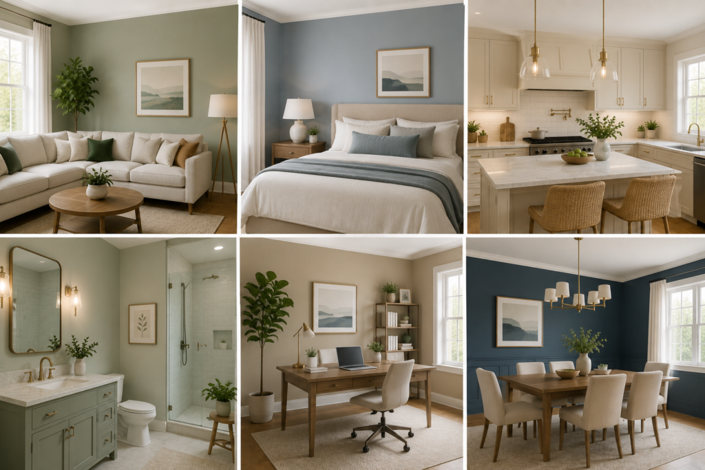
Choosing Paint Color by Room Function
| Room | Common Approach | Why |
| Living room | Warm neutrals or soft warm colors | Cozy, social atmosphere |
| Bedroom | Cool or muted tones | Calm, relaxing environment |
| Kitchen | Bright whites or warm neutrals | Clean, energizing feel |
| Bathroom | Cool tones or crisp whites | Fresh, calming, spa-like feel |
| Home office | Muted blues or greens | Focus-supporting, calm environment |
| Dining room | Deeper, richer tones | Intimate, inviting atmosphere for gathering |
| Small powder room | Bold or dark accent color | Creates intentional, dramatic small-space impact |
Common Paint Color Mistakes to Avoid
Choosing Color Without Testing in Your Own Space
Relying entirely on a small chip, an online preview, or how a color looked in someone else’s home, rather than testing directly on your own walls under your own lighting, is one of the most common and frustrating mistakes homeowners make.
Ignoring Undertones
Choosing a color based purely on its name or general category (like “gray” or “beige”) without checking its specific undertone often leads to a color that clashes unexpectedly with existing flooring, trim, or furniture once applied.
Not Considering the Whole Home’s Flow
Choosing each room’s color in complete isolation, without considering how it will look from adjoining spaces in an open floor plan, can result in a disjointed, visually jarring transition between rooms.
Painting the Entire Room Before Testing Enough
Committing to full-room application based on a small sample swatch viewed only briefly, rather than observing test patches across different times of day and lighting conditions, risks an unwelcome surprise once the full room is painted.
Practical Buying Tips
- Purchase sample-size paint pots and test directly on your walls before buying full-size cans for an entire room
- Observe test swatches across multiple times of day and under both natural and artificial lighting
- Bring fabric, flooring, or furniture samples with you when comparing paint colors, or bring paint samples home to compare directly
- Pay close attention to a color’s stated undertone, not just its general name or category
- For open floor plans, plan color choices across connected rooms together rather than room by room in isolation
Common Mistakes to Avoid
- Trusting a tiny paint chip over an actual painted sample on your wall, risking an unwelcome surprise once the full room is painted
- Ignoring undertones, choosing a color based on its general name without checking how its underlying hue will interact with existing elements
- Not testing across different times of day, missing how dramatically lighting can shift a color’s appearance from morning to evening
- Choosing dark, saturated colors in small, poorly lit rooms without considering how this might make the space feel more closed in
- Planning each room’s color entirely in isolation, missing the opportunity for a more cohesive, intentional flow throughout an open or connected floor plan
Conclusion
Choosing the right paint color comes down to genuine testing and observation, not just picking a shade that looks appealing on a small chip or in a photo. Test actual samples directly on your walls, pay attention to undertones and how your specific lighting affects color throughout the day, and consider how each room’s color choice fits within your home’s broader flow. Taking these extra steps before committing to a full can of paint will save you from the frustrating, common experience of a color that looked perfect in the store but genuinely disappointing once it covers your actual walls.
Frequently Asked Questions
1- How do I know if a paint color will look different once it’s on my wall?
Test an actual paint sample directly on your wall, ideally a two-foot square swatch, and observe it across different times of day, since lighting significantly affects how color reads compared to a small paint chip.
2- What does “undertone” mean in paint colors?
Undertone refers to the subtle underlying hue within a paint color, even seemingly simple neutrals like white or gray often carry a blue, green, purple, or yellow undertone that becomes more apparent once painted next to other colors and finishes.
3- What are the best paint colors for making a small room look bigger?
Lighter, cooler tones generally help small rooms feel more open and airy, since they reflect more light and create less visual weight than darker, warmer colors.
4- Should I choose warm or cool paint tones for my bedroom?
Cooler, more muted tones are commonly recommended for bedrooms, given their association with a calmer, more relaxing atmosphere, though this ultimately comes down to personal preference.
5- How many paint samples should I test before choosing a color?
There’s no strict number, but testing at least two to three different options directly on your wall, observed across different lighting conditions, gives you a considerably more informed basis for your final decision than relying on a single sample alone.
6- Do I need to match paint colors between connected rooms?
Not necessarily match exactly, but choosing colors with a complementary undertone or overall palette creates a more cohesive visual flow, particularly important in open floor plans where rooms visually connect to one another.
7- Why does my paint color look different than it did on the sample chip?
This is typically due to lighting differences between the store and your home, along with the fact that small chips don’t accurately represent how a color reads across an entire wall, which is why testing directly on your wall matters.